State Farm Insurance Company Lead Content Strategist
I architected the end-to-end content strategy for a home management app that would help State Farm customers maintain their biggest investment - their home. This included laying the groundwork to scale a content heavy part of the app using AI, and achieving legal and compliance approval on all content.
Note: Due to trademark restrictions the name of the app and branding have been removed.
State Farm Beta App
Requirements
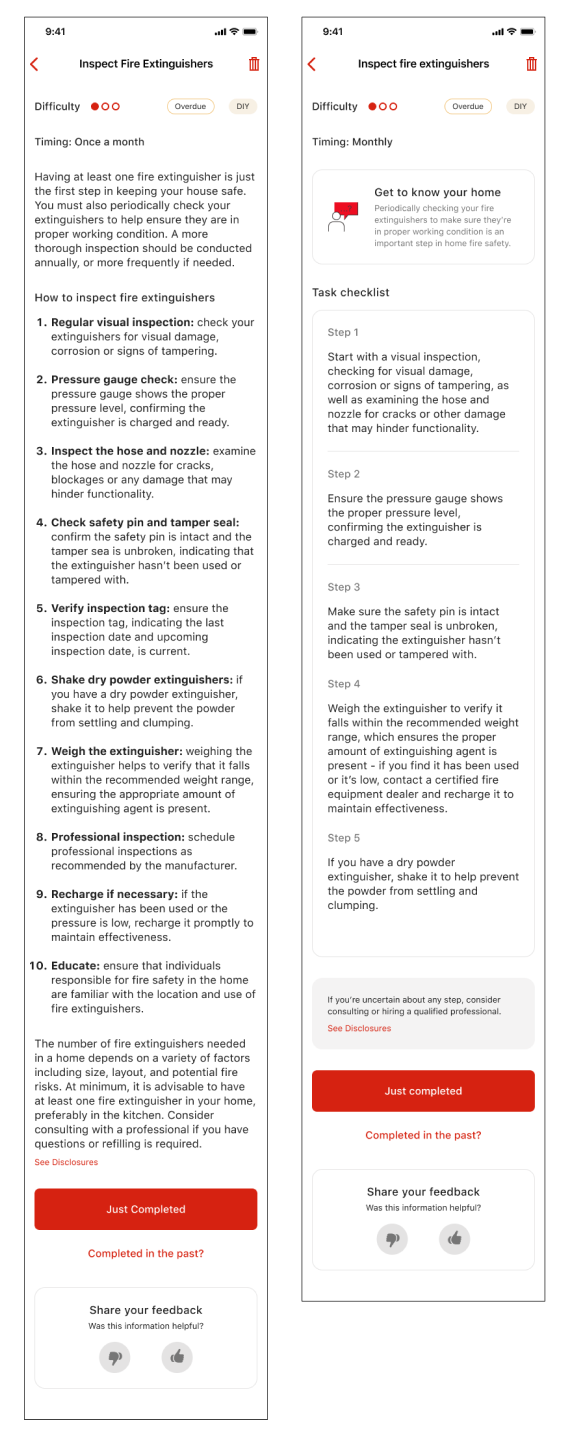
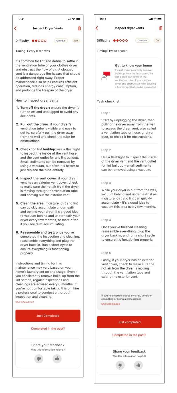
Based on unique home attributes, insights (tasks), are sent to users on a seasonal or weekly basis. These insights are the cornerstone of the app, the content that drives maintenance. It's also how the user could gain points for completing tasks, and use those points for discounted services and retail products. The strategy was to soften the intimidation of taking action, and organize content in a way that could scale for AI implementation and user engagement.
Content strategy
Due to the high number of required insights, we immediately switched from using purchased content to AI. I was able to prompt the AI to deliver content in 5 steps or less, and make the output clear and succinct.
I highlighted the value proposition of each insight under the warm invitation to "Get to know your home."
We were able to include legal requirements as a very small card before the CTA, and I removed all usage of title case. I also streamlined the way timing was presented. Every 6 months became twice a year. Once a month became monthly. Any way we can reduce cognitive load on a screen this busy is a win.
Delivery
The insights are accessible, and easy to approach with a limited number of steps. This allowed others to enter the space and generate content with set parameters. All content was taken through Legal approval prior to handoff.
Product designers: Kahri Jung and Aarsh Desai
State Farm Beta App value tour
Requirements
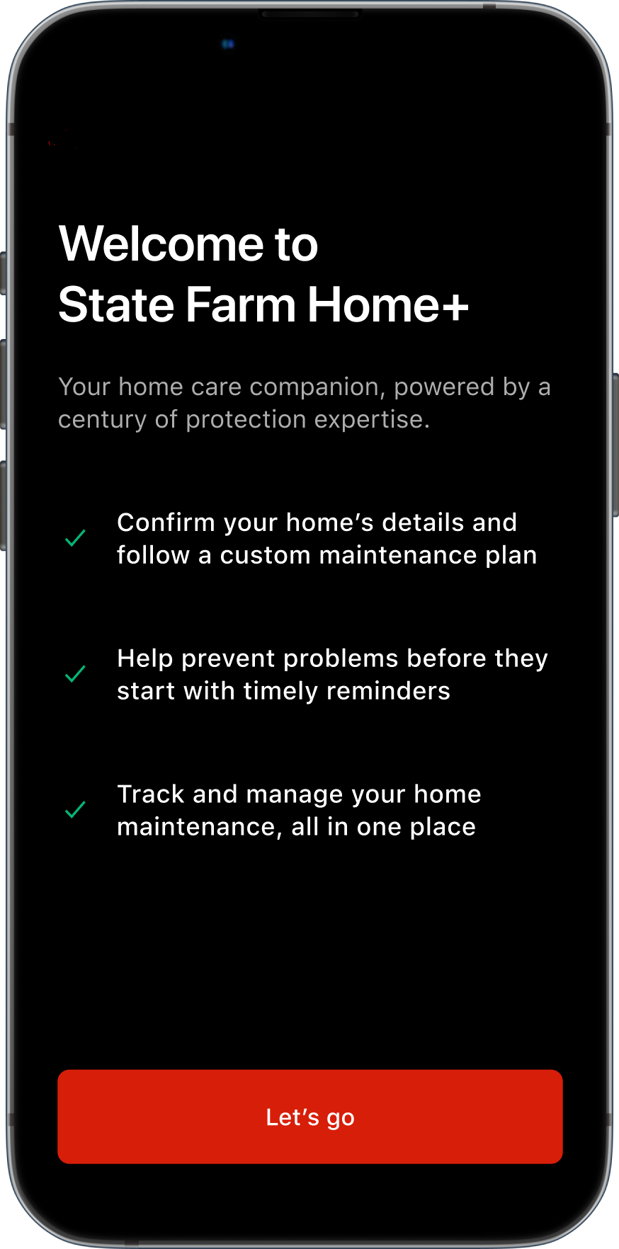
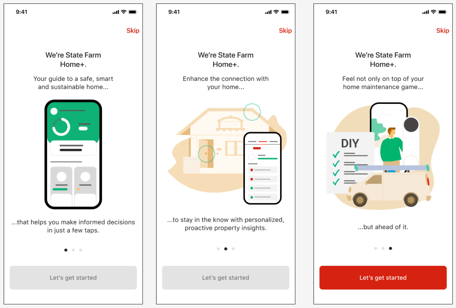
Once a user downloads an app, they should know right away what's in it for them. Written before a content strategist came aboard, the three screen value tour didn't hit the heart of the app.
Content strategy
I was close to all parts of the app and its purpose - to personalize, predict and prevent. I wanted to convey peace of mind, instill confidence in our product, and be the trusted guide to help get the work done. The original content had mentioned insights, the personalized tasks we'd send to users to maintain their home. At this stage in the game, an 'insight' meant nothing to the user.
Delivery
A succinct one page screen that pulls in the company's long and trusted reputation, sets user expectations, and reassures them it's a one-stop shop for home maintenance. I was also quick to remove the multiple ellipses, and not separate a thought with an illustration. As of July 2025 this app remains in a beta stage.
Note: These designs have been altered to remove branding.
Product designer: Aarsh Desai
Marketing support: Stephanie Helland