Xfinity app for Comcast Senior Content Designer and UX Writer
The primary experience touchpoint for customers to manage all their Xfinity services, the Xfinity app has 12 million+ users each month. I led content design on the account tab, identity login flows, WiFi hotspots and security features.
Connecting millions of customers to millions of secure WiFi hotspots, effortlessly
Requirements
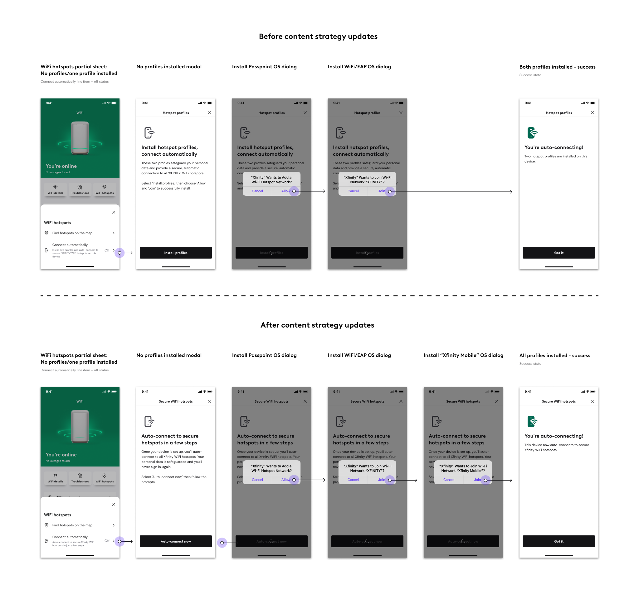
In 2023, Xfinity maintained eight apps, with one that focused on finding a WiFi hotspot connection via a map. While the hotspots got customers online, they weren't always secure connections. Looking to streamline its products and services, Xfinity began to sunset apps and merge them into one. This convergence would bring the hotspot map into the app, alongside a new technology that once installed on a device, would allow users to auto-connect to secure WiFi hotspots when in range.
Industry terms such as "install" and "profiles" were initially required to build this new app experiene, but with a user-first mindset, that soon changed.
Content strategy
Weeks before delivery, design proposed a content rework to remove all technical terms. This didn't come easy, particularly in the eyes of leadership. In an effort to reduce cognitive load, we proposed eliminating the words "profile," and the term "install," often seen as something that takes up space on a device. I focused on what the user receives once they take action, not the technical process to get them there. I credit a trusting and well established cross-functional relationship with the product owner for achieving buy-in.
During rewrites it was also announced that the secure network we were connecting users to would be renamed from 'XFINITY' to 'Xfinity Mobile,' and all references to a specific network needed to be reconsidered.
Delivery
Good designers know that iteration is the secret sauce to great design. Even if it's against hand off for the greater good, or six months down the road. Once the marketing pieces announcing this new product were highlighted in the app, over half a million users set up their devices to auto-connect in just two weeks.
Lead UX designer: Caleigh Norris
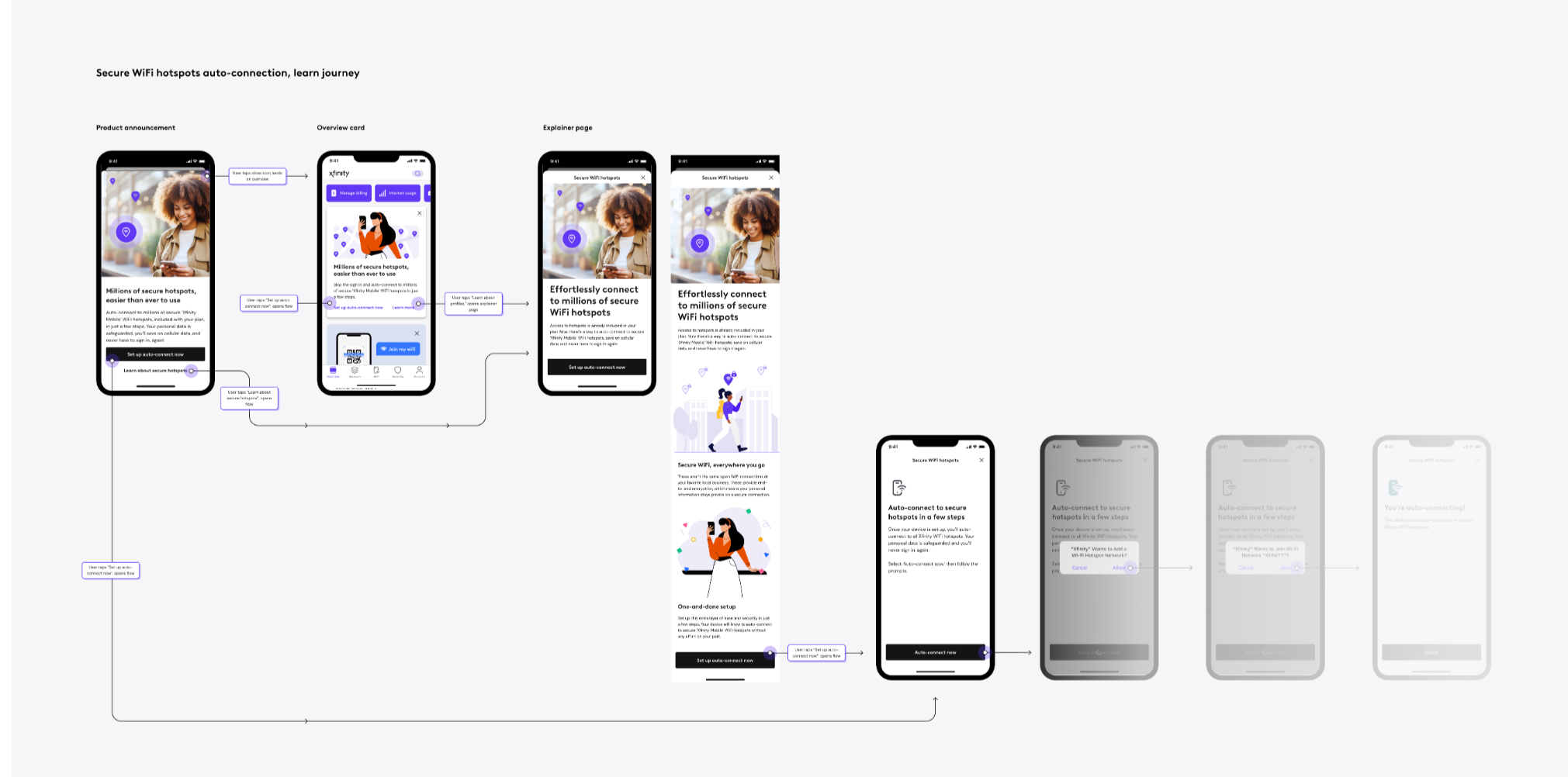
4.3 million impressions and half a million adoptees in two weeks: A learn journey for WiFi hotspots
Requirements
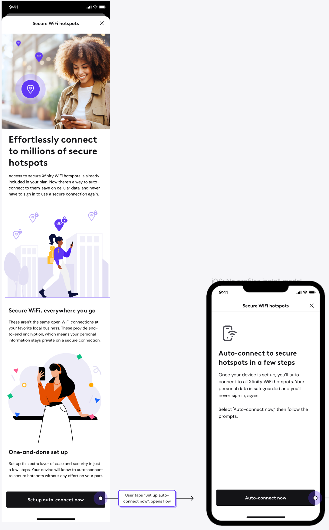
Now that Xfinity app users could set up their devices to auto-connect to secure WiFi hotspots (please see above), it was time to design a learn journey. Efficiency and security are top of mind when it comes to an internet connection on the go. How could we introduce this safe and effortless feature without losing our users attention with industry terms?
Content strategy
A feature that's technical on the backend, the content strategy was to sell this benefit in the simplest way possible, never assuming the reader knows everything. I wanted to remind a user they're already paying for it. I wanted to inform the user these WiFi connections aren't the same type of connection you might use at the library or your local coffee shop. I wanted to educate the user why end-to-end encryption really matters. And lastly, drive home the one-and-done nature of the feature. Once set up, you'll never have to think about it again. The feature is sold as effortless, safe, and easier than ever to use.
Delivery
A learn page, product announcement and overview card were produced. The product announcement, a full screen app takeover upon opening the app, was released on July 1, 2024. In the following two weeks it received 4.3 million impressions, a 13.6% click through rate and 568,020 users took action to set up their devices and auto-connect.
Lead UX designer: Caleigh Norris
36% increase in conversion after two weeks: Advanced Security on the go
Requirements
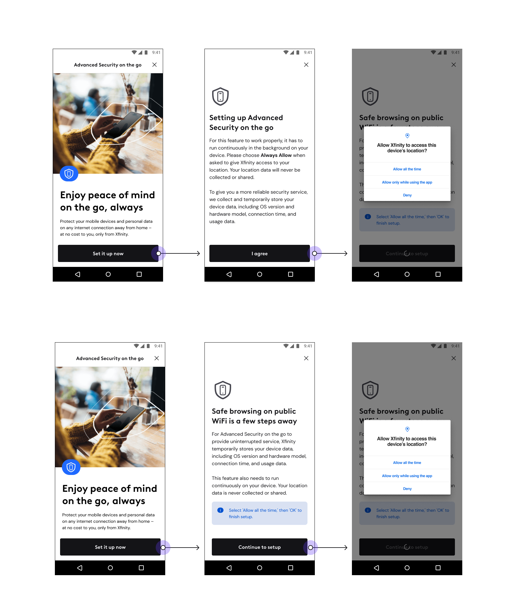
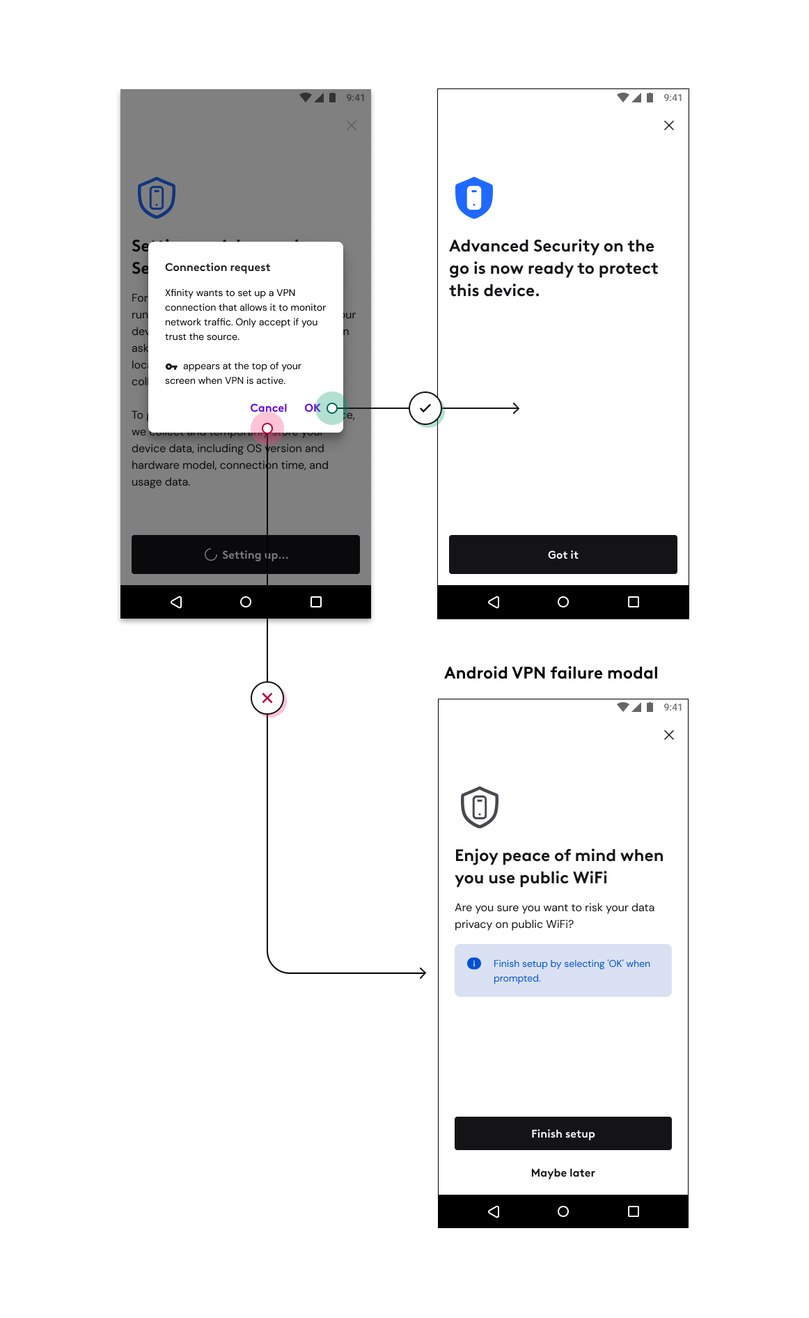
Advanced Security on the go provides protection for your device on unsecure WiFi networks - think airports or coffee shops - by keeping your data protected via end-to-end encryption and blocking malicious websites from accessing your device. In order to do this, it needs to know your device location, and set up a VPN in order to block potential attackers.
Android users were dropping out at an alarming rate of 49% after the first info disclosure screen. It needed an overhaul, and to keep users moving through the flow, we introduced a net new VPN permissions modal to instill confidence.
Content strategy
Language in the first screen, the info disclosure modal, had been written by engineers and the legal team. While I had to keep legal language intact, I wanted to reinforce the feature's value and separate the informative from the actionable copy.
I challenged our UX team to find a treatment in our design system that acted as a sort of callout box. With the sentiment that people don't read, how could I harness the headline and a callout box to bring them over the finish line? The CTA was also reworked so it didn't read like a legal binding.
The tone of the net new VPN permissions modal gave positive reinforcement of what could be gained by continuing to set up. I also sprinkled a dash of fear in there.
Delivery
The use of the blue callout box was brought to life. The headline was also an improvement, one that highlights the value proposition of the feature and gives the user confidence to move through the flow. After two weeks of implementation, users were coming through the front door and setting up their devices. The new VPN permissions screen saw a 36% increase in conversion, enough to be made permanent.
UX designers: Sarah Zulhsdorf and Caleigh Norris